Features
Everything Fontane.Studio can do today, running entirely in your browser — from a first pressure-sensitive sketch to a finished, exportable font.
Draw & capture
Grid View
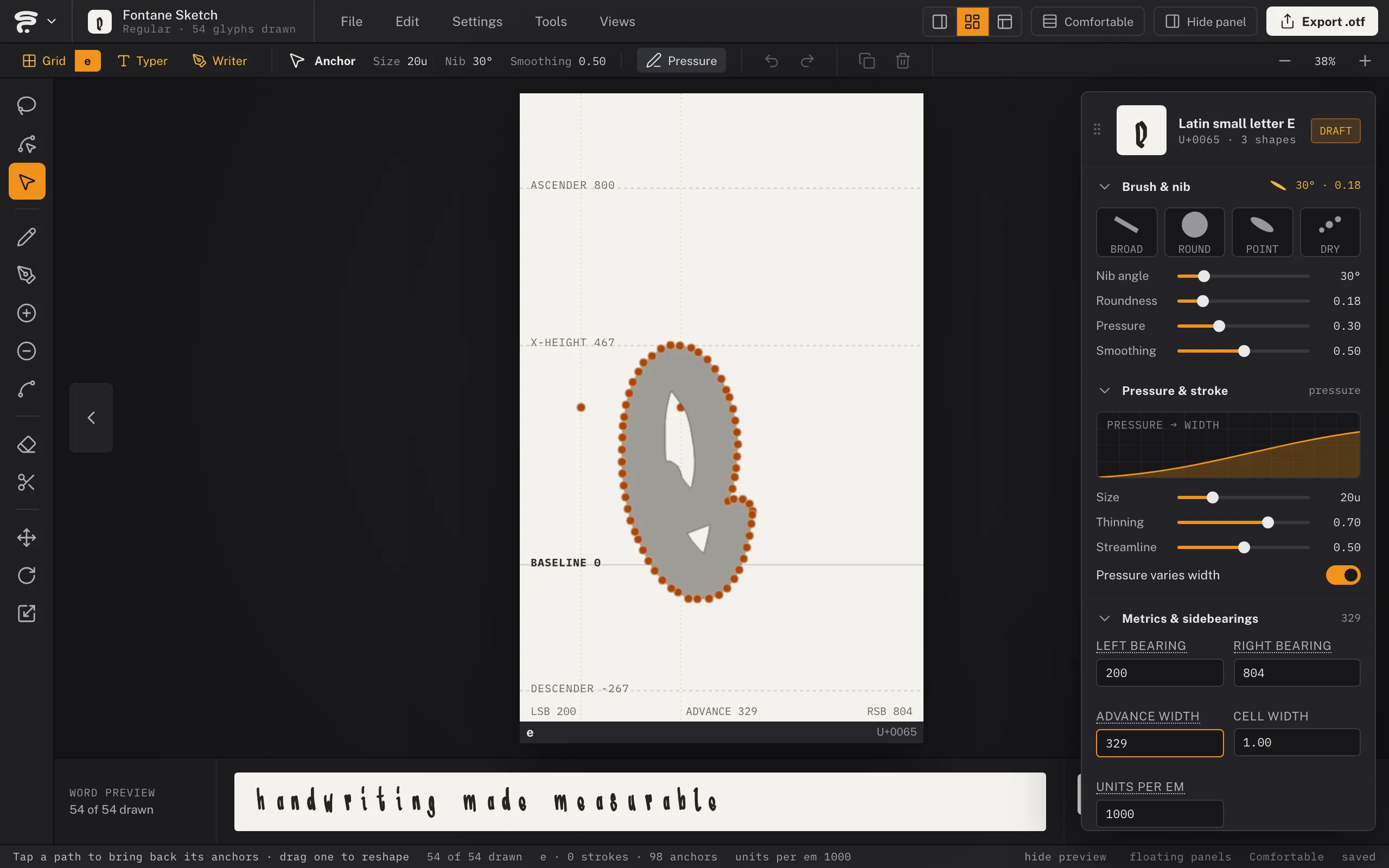
One cell per character, with ascenderThe parts of a lowercase letter that reach above the x-height (the stem of a 'b', 'd', 'h', 'k', 'l') or below the baseline (the tail of a 'g', 'j', 'p', 'q', 'y')., x-heightHow tall lowercase letters are, measured from the baseline to the top of an 'x' — the single biggest factor in how big or small a typeface reads at the same point size., baselineThe invisible line every letter sits on — the flat bottom of an 'a', 'e', or 'x'. Descenders (the tail of a 'g' or 'y') hang below it., and descender guides plus draggable side bearingsThe empty space to the left and right of a glyph's ink, inside its own advance width — what actually keeps neighboring letters from touching. Fontane's Grid View lets you drag these directly as guide lines, and the Typer can widen or tighten every letter's at once. — the systematic way to draw a full alphabet. A Lock Bearings toggle freezes the bearings so drawing over one draws instead of dragging it. A Reference Letterform toggle shows a faint Comic Sans backdrop as an orientation guide, sized to that cell's own guides — it disappears the instant you start drawing your own design in that cell.
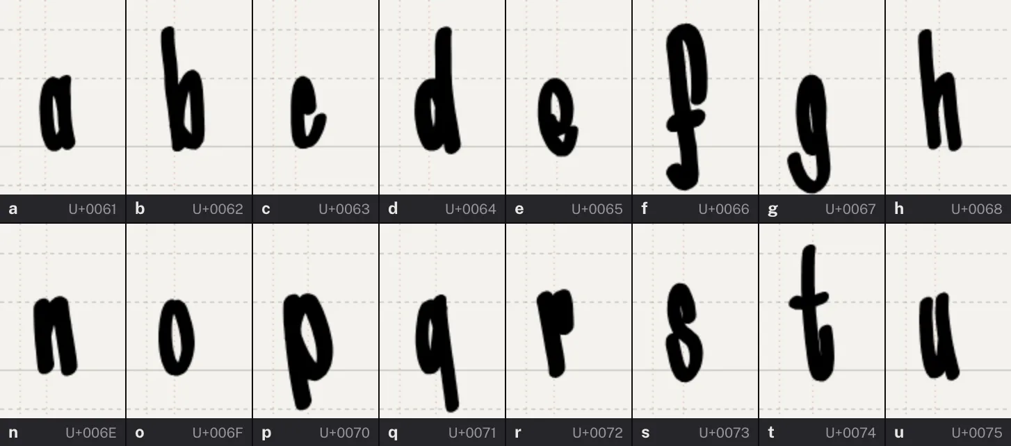
Mono line & Dynamic strokes
Switch between constant-width ink and pressure-responsive thickness, with live size/thinning/streamline controls and a live stroke preview showing exactly what the current brush and settings produce.
Brush & nib
The pencil's tip is a nib — angle, roundness, and pressure sliders, with Broad, Round, and Point presets — so the same pencil sweeps a calligraphic Italic hand or a monoline script. Restyle every letter at once by changing the nib later; the drawn path stays the source.
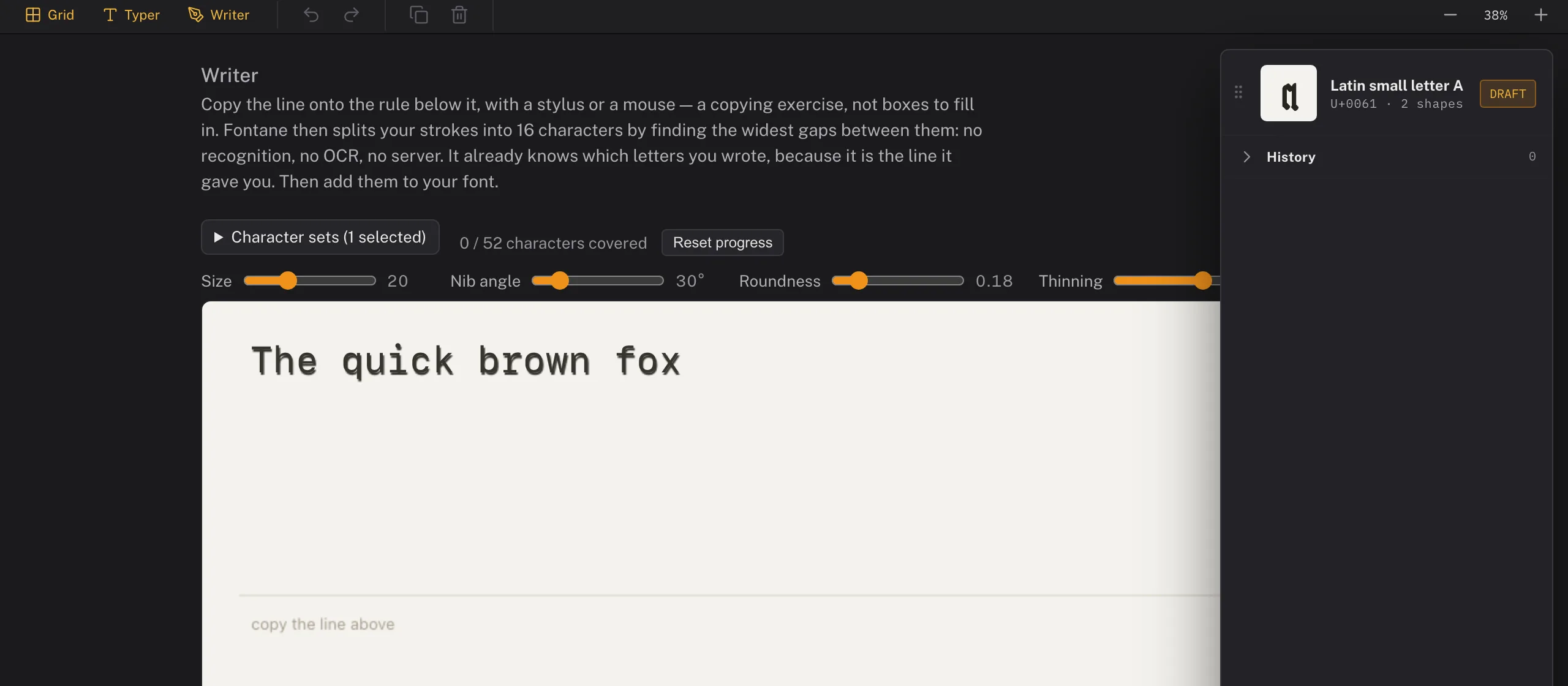
Writer (beta)
Copy a printed reference line with the stylus instead of drawing letter by letter — because the text is already known, Fontane only has to work out where one letter ends and the next begins (the biggest gaps between strokes), not what each one is. No OCR, no handwriting recognition, no server round-trip. Queue up whole character sets (Latin Basic, Cyrillic, punctuation, and more) and track coverage as you go, or type your own reference text for a script or language outside the built-in sets. Undo (Cmd/Ctrl+Z, or the on-screen button on touch/tablet) removes the last stroke.
Precision vector tools
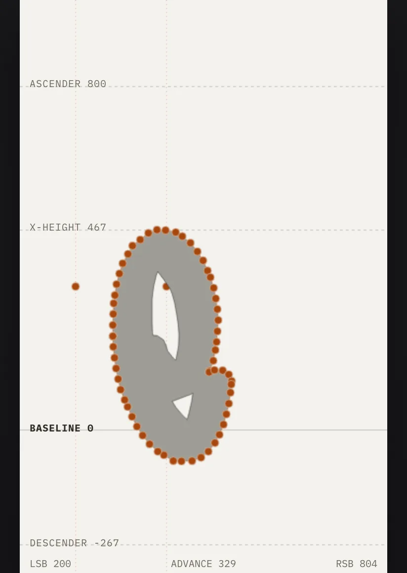
Vector pen
A true Bezier pen (P) that also reads your drawn ink — click its own end anchor to keep drawing, click a middle one to remove it, click along the line to insert one. A dedicated Anchor Point tool (⇧C) converts a corner to a curve and back. Works directly inside Grid cells, where shapes auto-tag to the cell's character.
Fill & outline rendering
Every vector path can render as a solid fill (the default) or as an outline instead — pick which from the Outlines panel, with a width slider once Outline is on. A separate Brush/Even-width switch decides whether that outline follows the pencil's pressure or runs at one constant thickness. Outline works on open paths too, so a line that never closes still exports as real ink instead of being dropped from the font.
Smooth anchors & held-key modifiers
Smooth points keep their handles in tangent continuity; Alt breaks the pair, double-click toggles smooth/corner. Hold Cmd for momentary direct selection, Shift for 45° constraints, Alt on the Pencil to reach for the same anchor editing without switching tools — and the pen cursor tells you what a click will do before you do it.
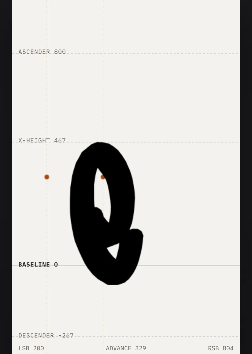
Counters
Draw a shape inside another and it becomes the counterThe enclosed or partially enclosed space inside a letter — the hole in an 'o', the two spaces in a 'B'. Draw it too small and the letter clogs up at small sizes. — a 'B' or 'O' works in pure vector. Where strokes are involved, closed shapes punch holes through them instead, the classic way to cut an 'o' or 'e'.
Direct Select
Reshape an already-drawn stroke or vector path point by point — drag, add, or delete its anchors — without redrawing it.
Organize your alphabet
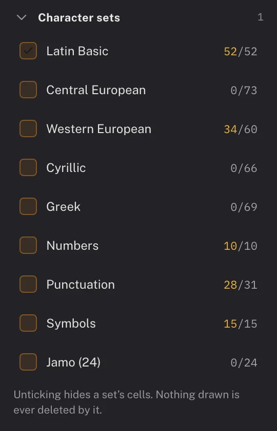
Character sets
New fonts start focused on Latin Basic (a–z, A–Z); toggle on Central European, Western European and Turkish accents, Cyrillic, Greek, Inuktitut, Dene Zhatıé, Lakota, numbers, punctuation, and symbols whenever you're ready — glyphsOne drawn shape in a font — not quite the same as a 'character'. The character 'a' might have several glyphs behind it: a base form, a bold alternate, a swash variant, each its own outline. you've already drawn always keep their cell.
Ligatures & alternates
Tag a drawn shape as a ligatureTwo or more letters redrawn as a single joined glyph — classically 'fi' or 'fl', where the dot of the 'i' would otherwise collide with the hook of the 'f'. (e.g. 'fi') and it exports with a real, automatic OpenType ligaA named, switchable behavior built into a font file — ligatures, stylistic alternates, and contextual alternates are each their own feature, off by default in most apps unless the user (or the app) turns them on. rule — the ligature triggers on its own in apps that respect the feature. Stylistic alternatesA second (or third) drawn version of a letter, available as a substitute for the default — a different lowercase 'a', a swashy capital, a single-story 'g'. The letter still means the same thing; it just looks different when chosen. export as their own named glyphsOne drawn shape in a font — not quite the same as a 'character'. The character 'a' might have several glyphs behind it: a base form, a bold alternate, a swash variant, each its own outline. for manual selection, and double as automatic variety: draw one alternate for a letter and a real caltAn automatic rule baked into a font that swaps in a different glyph depending on what's next to it — so the same letter doesn't look identically stamped every time it repeats. The mechanism itself lives in the font file, not in whatever app displays the text. rule swaps it in whenever that letter repeats back to back, so hand-drawn text doesn't read as a stamped-out font.
Custom glyphs
Add any one-off base character, ligatureTwo or more letters redrawn as a single joined glyph — classically 'fi' or 'fl', where the dot of the 'i' would otherwise collide with the hook of the 'f'., or alternateA second (or third) drawn version of a letter, available as a substitute for the default — a different lowercase 'a', a swashy capital, a single-story 'g'. The letter still means the same thing; it just looks different when chosen. outside the built-in sets by name.
Edit & arrange
Select, Move, Rotate, Scale, Skew, Mirror
Lasso-select any combination of strokes and vector shapes, then transform them as a group — Alt-drag under Move leaves a copy behind, Skew slants or shears, and Mirror (F) flips the selection left to right with a click, top to bottom with Shift. Hold Cmd/Ctrl while any drawing or edit tool is active for a momentary Select, Illustrator-style — release and you're back to what you were doing.
Copy & paste
Duplicate strokes and shapes within the Grid — paste into a different cell and it's automatically fitted to size.
Undo/redo
A full history stack covering drawing, tagging, and transform actions.
Focused workspace
Related tools stack into Illustrator-style flyout slots (long-press to expand), and the settings palette shows only what the active tool actually uses — GlyphsOne drawn shape in a font — not quite the same as a 'character'. The character 'a' might have several glyphs behind it: a base form, a bold alternate, a swash variant, each its own outline.-style collapsible sections, with a live Path info box while you're on the pen.
Compose & preview
Typer
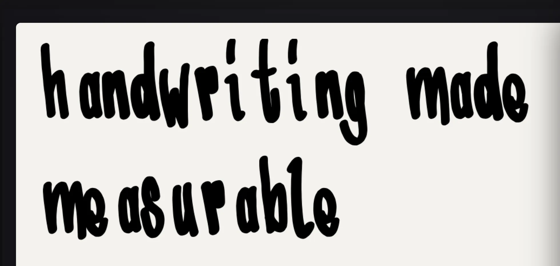
Type freely using your own already-tagged glyphsOne drawn shape in a font — not quite the same as a 'character'. The character 'a' might have several glyphs behind it: a base form, a bold alternate, a swash variant, each its own outline. to see how your in-progress font reads as real text — or load a sample: everything you have drawn, a poem by Theodor Fontane with its line breaks, or a pangram for each character set.
Spacing & kerning
Widen or tighten every letter's sidebearingsThe empty space to the left and right of a glyph's ink, inside its own advance width — what actually keeps neighboring letters from touching. Fontane's Grid View lets you drag these directly as guide lines, and the Typer can widen or tighten every letter's at once. at once — by a share of each letter's own, so its rhythm stays, or by a fixed number of units. Then kern where it reads wrong: put the cursor between two letters and press ⌥← or ⌥→, the way InDesign does. Pairs are between letters, not single shapes, so T·o also covers ö and every alternateA second (or third) drawn version of a letter, available as a substitute for the default — a different lowercase 'a', a swashy capital, a single-story 'g'. The letter still means the same thing; it just looks different when chosen. o; where one shape needs its own value, an exception sets it for exactly those two glyphsOne drawn shape in a font — not quite the same as a 'character'. The character 'a' might have several glyphs behind it: a base form, a bold alternate, a swash variant, each its own outline.. It all goes into the .otf as a real kern feature, and every style follows the master.
Export anywhere
OTF export
A complete OpenType font file, compiled entirely in your browser — nothing is uploaded, nothing to install.
UFO export
The font as a UFO source package, the interchange format RoboFont, FontForge, GlyphsOne drawn shape in a font — not quite the same as a 'character'. The character 'a' might have several glyphs behind it: a base form, a bold alternate, a swash variant, each its own outline. and the fontTools toolchain all read — so a drawing can be finished in a professional type editor, carrying the spacing and kerningA manual spacing adjustment for one specific pair of letters — classically 'AV' or 'To', where the default spacing looks too loose because the letter shapes interlock. Applied pair by pair, not to the whole font. In Fontane's Typer: cursor between the two letters, then ⌥← or ⌥→. set here as groups and pairs. Fontane's outlines go in as the same cubic curves the .otf carries, with no conversion in between.
Font metadata
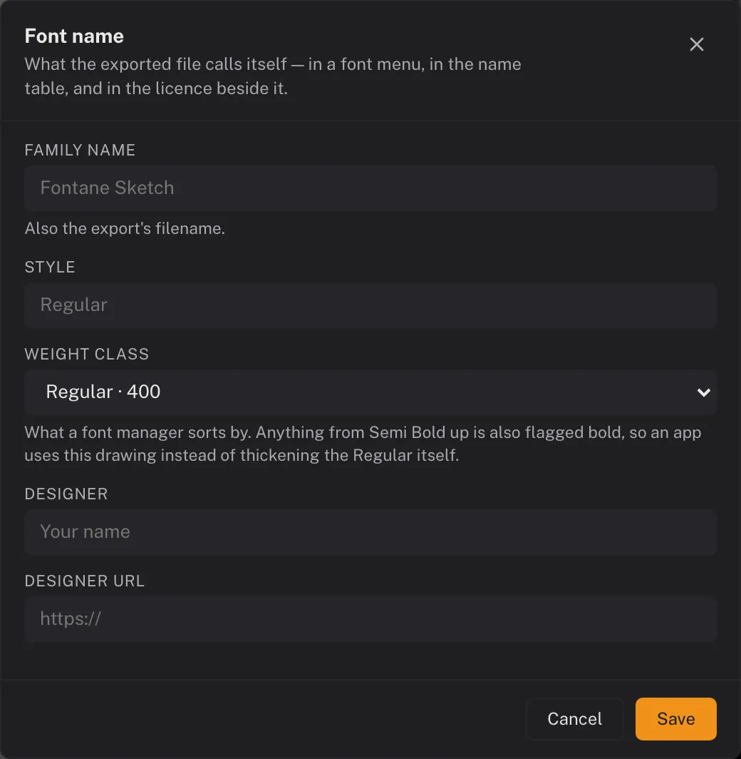
Family name, style, designer, homepage, licence and copyright are written into the font's name table, so an exported font says who made it instead of installing anonymously.
FFF project files
Fontane's own save format — every stroke, glyphOne drawn shape in a font — not quite the same as a 'character'. The character 'a' might have several glyphs behind it: a base form, a bold alternate, a swash variant, each its own outline., and setting, so you can pause and resume a font later or move between devices.
Glyphs.app import script
A Python script for GlyphsOne drawn shape in a font — not quite the same as a 'character'. The character 'a' might have several glyphs behind it: a base form, a bold alternate, a swash variant, each its own outline..app that reads an FFF file directly and builds real glyphs with correct components and Bezier nodes.
Share your font
Marketplace
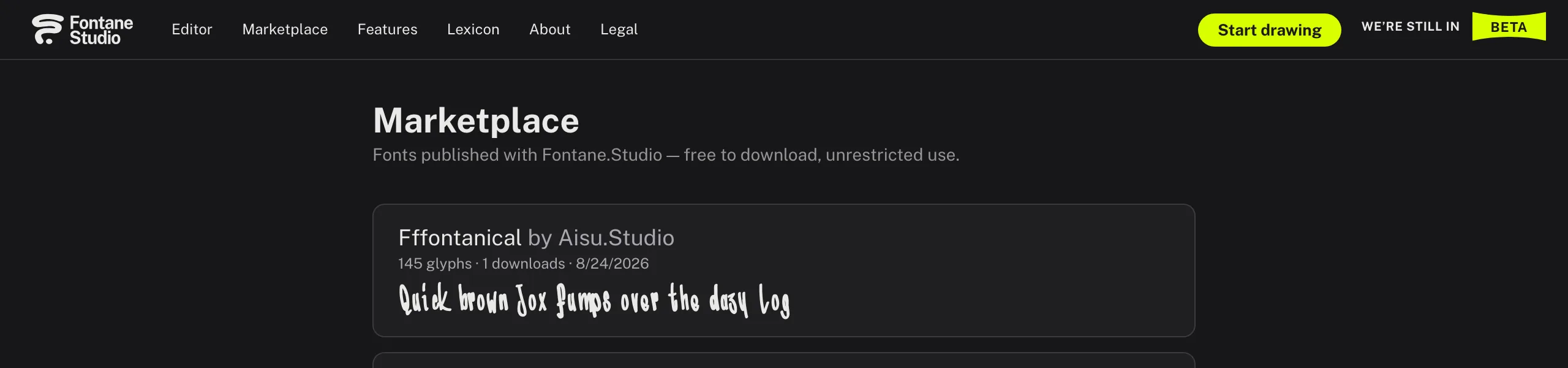
Publish a finished font for anyone to browse and download, or share a direct link to it.
Provenance gate
Before a font can be published, Fontane checks for a plausible history of real drawing activity — a lightweight guard against converted or stolen fonts.
Built for privacy
No trackers
No cookies, no third-party analytics or ad scripts, no persistent identifier written to your device.
Local-first
Your drawings live in your browser's own storage — nothing reaches our servers unless you explicitly export or publish.